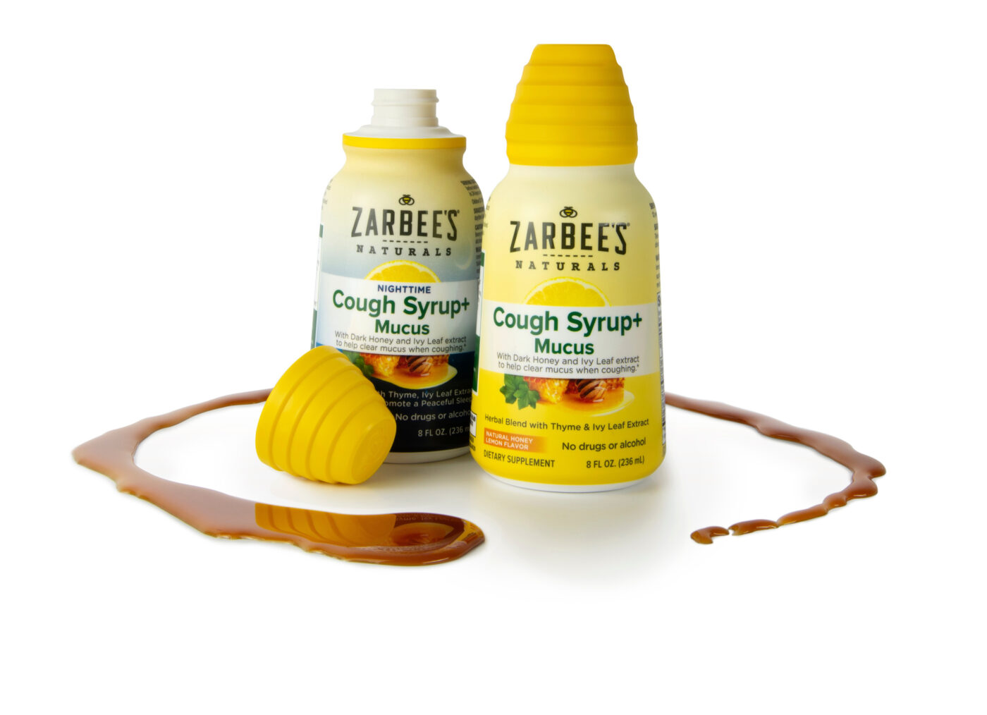
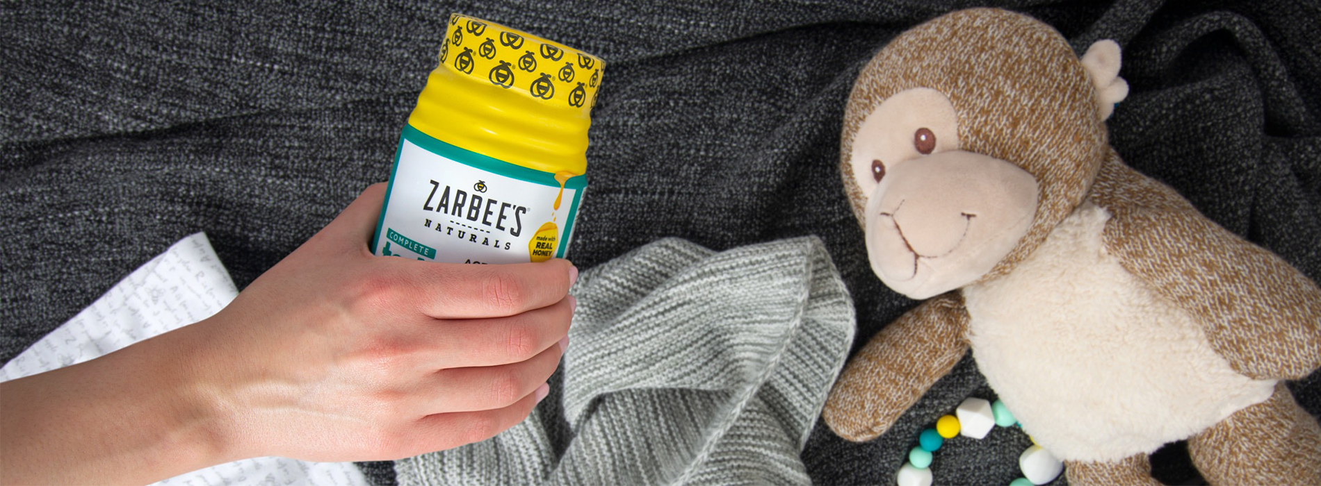
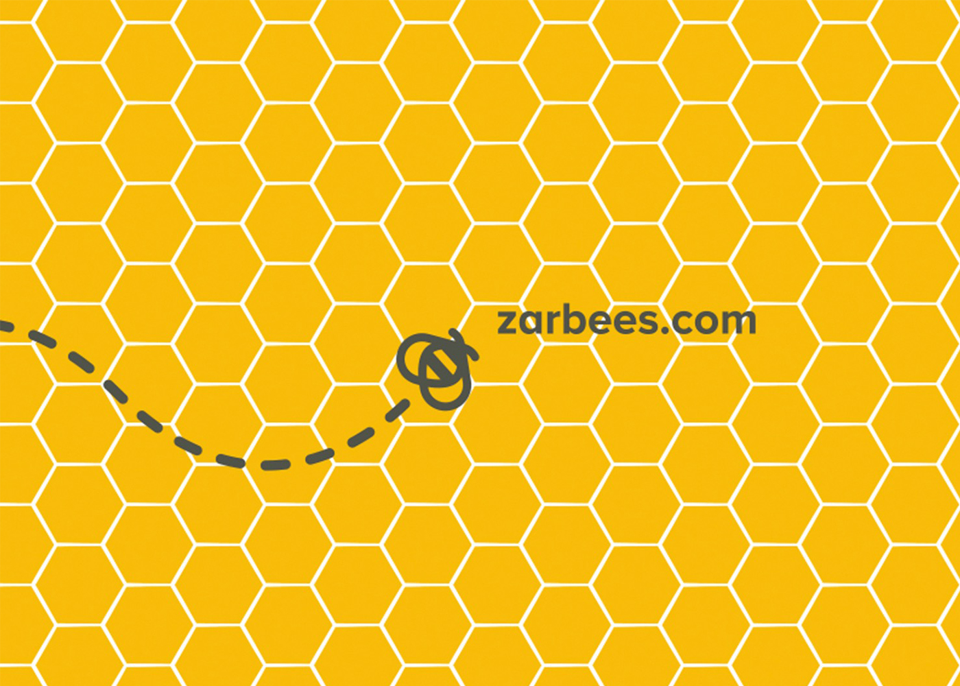
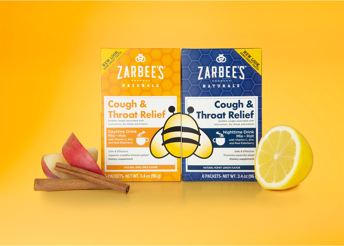
Zarbee’s built its name soothing kids’ coughs with a simple, doctor-invented idea: honey works. But when it came time to grow up and expand into adult wellness, they asked us to help the brand evolve—without losing its warm, trustworthy soul. We gave Zarbee’s a more sophisticated voice and look that parents could still recognize in the medicine aisle, and grown-ups could proudly keep on their nightstand.
Client
Zarbee's
Industry
Supplements
Services
Product Design
Engineering
Recognition
TBD
The
Details
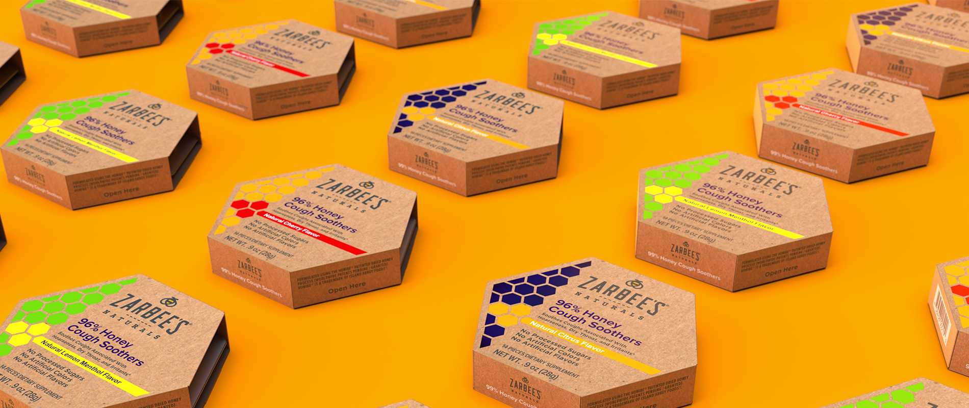
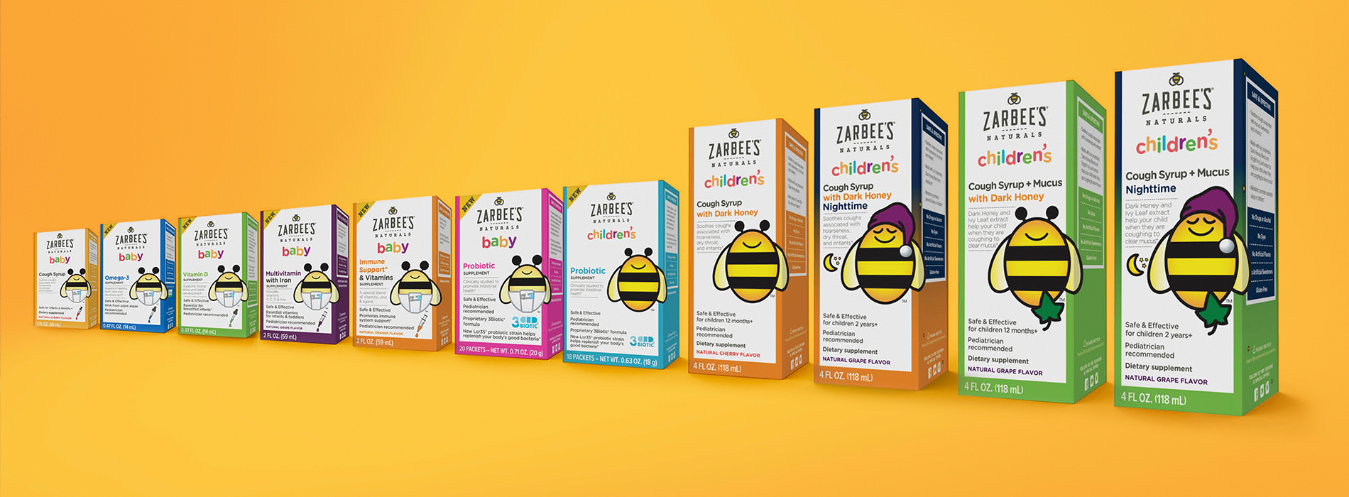
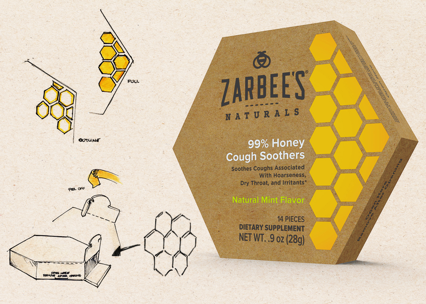
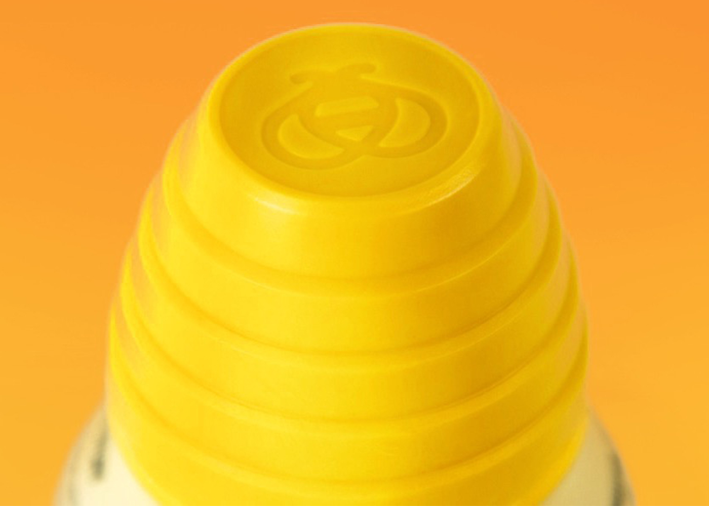
We refined Zarbee’s visual brand language from top to bottom—unifying their kids, baby, and adult lines into one cohesive system. Each element was rethought to feel natural, clear, and just a little more polished: honey tones that glow, typography that breathes, and illustrations that make wellness feel human again.
Across more than 50 SKUs, we crafted packaging that communicates “clean, effective, no-junk” without ever feeling clinical. The result? A brand that still knows how to care for kids—but can now speak grown-up, too.